Data presentation and experiment parameter inspection
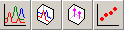
Data collected in a set may be displayed as a graph. There are two basic display types: 2D and 3D. It is possible to display 3D diagram even if there is only one file in the data set, or if only one is selected.
 In
order to display a graph of the set data one clicks any of the two toolbar
buttons representing 2D and 3D graphs. If none of the set rows is
selected then all files will be included in a diagram. If there are files
selected, only their data will be included. A list of files used is presented in
the upper right part of the diagram window. The list may be also used to select
diagram lines.
In
order to display a graph of the set data one clicks any of the two toolbar
buttons representing 2D and 3D graphs. If none of the set rows is
selected then all files will be included in a diagram. If there are files
selected, only their data will be included. A list of files used is presented in
the upper right part of the diagram window. The list may be also used to select
diagram lines.
 When
the diagram window is displayed it is possible to switch between different
diagram types using the buttons similar to those in the set window. For
3D and All Peaks views it is possible to choose the Z axis data.
The combo box Z axis displayed on the toolbar contains all available
fields for which values may be displayed on the Z axis. Selecting one of them
causes the diagram to redraw according to new axis definition.
When
the diagram window is displayed it is possible to switch between different
diagram types using the buttons similar to those in the set window. For
3D and All Peaks views it is possible to choose the Z axis data.
The combo box Z axis displayed on the toolbar contains all available
fields for which values may be displayed on the Z axis. Selecting one of them
causes the diagram to redraw according to new axis definition.
For Peaks view it is possible to choose the X axis data. The combo box X axis displayed on the toolbar contains all fields available to choose from.
For All Peaks and Peaks views it is also possible to choose values presented on Y axis. One selects it through the [Y axis] menu command. Data displayed is taken from either peak section or summary section of the data file, depending on mode selected.
For all 3D views it is possible to rotate the diagram and change perspective mode using3D frame controls: sliders are used to tilt and swivel the 3D cage of the diagram and can be operated either with mouse or with keyboard.
When the diagram in the 2D view is displayed it is possible to choose between two display modes: Highlight and Show one. One changes the mode through the [View] menu command. In the Highlight mode all lines are overlapping and the one selected is displayed in bold, while in Show one mode only the selected line is displayed.
Normalizations, X*Y, time scale and capacitance/concentration display modes
 In
many views it is possible to see data as read from file, with no modification,
or in specialized, enhanced mode.
In
many views it is possible to see data as read from file, with no modification,
or in specialized, enhanced mode.
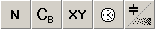
Sometimes, when viewing data obtained by different methods it is necessary to normalize them in order to be able to make a meaningful comparison. The Normalize toolbar button (N) allows the standard normalization to be turned on and off.
For spectra and CT diagrams it is also possible to normalize data not with the highest peak value, but rather with capacitance with bias voltage applied; the Normalize with Bias Capacitance button (CB) turns this mode on and off.
For diagrams displaying X axis data in logarithmic scale, if peak areas are to be compared visually, it is more convenient to display Y axis data as f(x) = y*x instead of the standard f(x) = y. Appropriate button Display X*Y (XY) turns this display mode on/off (see the previous chapter for more details).
For diagrams displaying time constant or time along X axis it is possible to switch between these modes using Frequency/Time toolbar button (º).
For CV measurements it is possible to present data as capacitance vs. polarisation voltage or as a carrier concentration vs. depth (in um). Capacitance/Concentration button is used to switch between these modes.
 The
Laplace DLTS spectrum file contains all parameters of peaks found in the
spectrum. These peak attributes can be displayed in parallel with the spectrum.
While in 2D view one can use Show peaks button to turn on the second,
additional diagram displayed below the spectrum diagram. It uses the same X axis
value range as the spectrum diagram. Point position on the X axis is the same as
the corresponding peaks centre of gravity; its height shows the peak amplitude.
Peaks and their attributes are displayed for the spectrum selected on the main,
upper diagram. When no spectrum/file is selected, no peaks attributes are
displayed.
The
Laplace DLTS spectrum file contains all parameters of peaks found in the
spectrum. These peak attributes can be displayed in parallel with the spectrum.
While in 2D view one can use Show peaks button to turn on the second,
additional diagram displayed below the spectrum diagram. It uses the same X axis
value range as the spectrum diagram. Point position on the X axis is the same as
the corresponding peaks centre of gravity; its height shows the peak amplitude.
Peaks and their attributes are displayed for the spectrum selected on the main,
upper diagram. When no spectrum/file is selected, no peaks attributes are
displayed.
The same spectrum file contains also synthetic peak data, i.e. total amplitude of all peaks versus their averaged emission rates. This data can be displayed on the same lower diagram instead of individual peak data. There is a button (and menu entry) to switch between these modes.
The lower diagram is mouse-event sensitive. It is possible to select peak by clicking its symbol. Selected peak parameters are displayed in the Peak frame to the right of the diagram. It is possible to select a certain peak for further processing. Pressing the This button under the data frame marks the currently selected peak. When the diagram screen is closed this information is saved with the data set. The next time a set is displayed, this selection is restored. A small T-shaped sign is displayed above the selected peak symbol. To deselect a peak the None button should be used.
In the same Peak frame, separated from individual peak fields, there are displayed peak summary data: total amplitude and averaged emission rate. These values are displayed as long as there is a spectrum selected on the upper diagram, regardless of the lower diagram display mode.
 Having the data set with peaks selected it is possible to draw
diagrams showing peak values (emission rate/time constant, amplitude or
broadening) versus some other measurement parameter, e.g. temperature, magnetic
field or filing pulse amplitude. These toolbar buttons are used to invoke All
Peaks and Peaks diagram appropriately. These are scatter diagrams showing
points representing chosen peaks values versus various measurement parameters,
selected through the toolbar combo or menu command. Peak value may represent any
of its attributes, as mentioned above, as selected through appropriate menu
command.
Having the data set with peaks selected it is possible to draw
diagrams showing peak values (emission rate/time constant, amplitude or
broadening) versus some other measurement parameter, e.g. temperature, magnetic
field or filing pulse amplitude. These toolbar buttons are used to invoke All
Peaks and Peaks diagram appropriately. These are scatter diagrams showing
points representing chosen peaks values versus various measurement parameters,
selected through the toolbar combo or menu command. Peak value may represent any
of its attributes, as mentioned above, as selected through appropriate menu
command.
Peak diagrams are mouse sensitive, if desired; this property is switched on/off through toolbar button marked with cursor icon (ã). Clicking diagram points causes the data to be displayed to the right of the diagram. Also the corresponding entry in the file list is highlighted.
It is possible to remove temporarily certain points from the diagram. Right-clicking any list entry removes the corresponding point from the diagram and the entry in the list is marked with tilde (~). Clicking the list entry again restores corresponding point.
 Conventional DLTS measurement data require special further
processing. First, there is additional data stored in the file, i.e.
one-exponent and three-exponent fitting of DLTS curve. So there is a possibility
to show this additional data together with measured points. Toolbar button
Show peaks used in case of Laplace DLTS to invoke additional diagram
(of spectrum peaks) in this case is used to invoke a diagram of fitting points.
Both 1exp and 3exp fitting is shown in different colours on the same additional
diagram, displayed below the main one. The same lower diagram may be used to
display peak data; Exponents/Peaks button is used to switch between
modes.
Conventional DLTS measurement data require special further
processing. First, there is additional data stored in the file, i.e.
one-exponent and three-exponent fitting of DLTS curve. So there is a possibility
to show this additional data together with measured points. Toolbar button
Show peaks used in case of Laplace DLTS to invoke additional diagram
(of spectrum peaks) in this case is used to invoke a diagram of fitting points.
Both 1exp and 3exp fitting is shown in different colours on the same additional
diagram, displayed below the main one. The same lower diagram may be used to
display peak data; Exponents/Peaks button is used to switch between
modes.
The most important feature of conventional DLTS diagram is peaks: their position, shape and amplitude. As there is no automatic procedure to find the peaks, user has to point them manually. Hence there is a special display mode in which this is done. On the upper diagram there is a DLTS data displayed, with cursor which can be moved with mouse or keyboard. After showing a peak (setting cursor at its position) and pressing Enter/clicking the This is a peak! button, the peak coordinates and value are displayed on the side panel. Peak data is stored in the measurement file, number of the last selected one in the database.
After peaks are selected one may display them along with the main data, as mentioned above.
It is possible to use both mouse and keyboard to work in peak selection mode: cursor can be switched on/of by clicking left and right mouse buttons or using Ins and Esc keys; cursor may be moved by clicking and/or dragging mouse or using cursor keys Left, Right, Home and End. A peak may be selected either by clicking screen button or by pressing Enter key.
Printing of diagrams (any of them) is done through procedures built into the Graphic Server. After recalling the diagram property pages (with right mouse button) and selecting the System tab it is possible to set some printing options and then print the diagram. Always the default Windows printer is used. It is possible to use a shortcut to the above Graphic Server functionality using the [File|Print ] menu command. One can also set printer properties from within the program using the [File|Printer Setup ] command, although it is not possible to change default Windows printer in this way.
It is also possible to store the diagram as a Windows metafile, bitmap or JPEG file using other options available on the same System tab.